Style & Design
How to Choose a Color Palette for Your Home in 3 Easy Steps
More than the furniture and accent pieces, what holds your home's design together is having a color scheme. If you stop for a second and look around, you'll notice that every room in your house has a color palette, even if it is just monochromatic. While the design style you choose has a lot to do with how each room feels, figuring out how to pick a color palette is the one thing that will pull everything together.
At Spacejoy, we want to help you design the home of your dreams, one room at a time. Today, we're sharing some of our best-kept secrets on how to choose a color scheme.
1. Choosing Your Colors

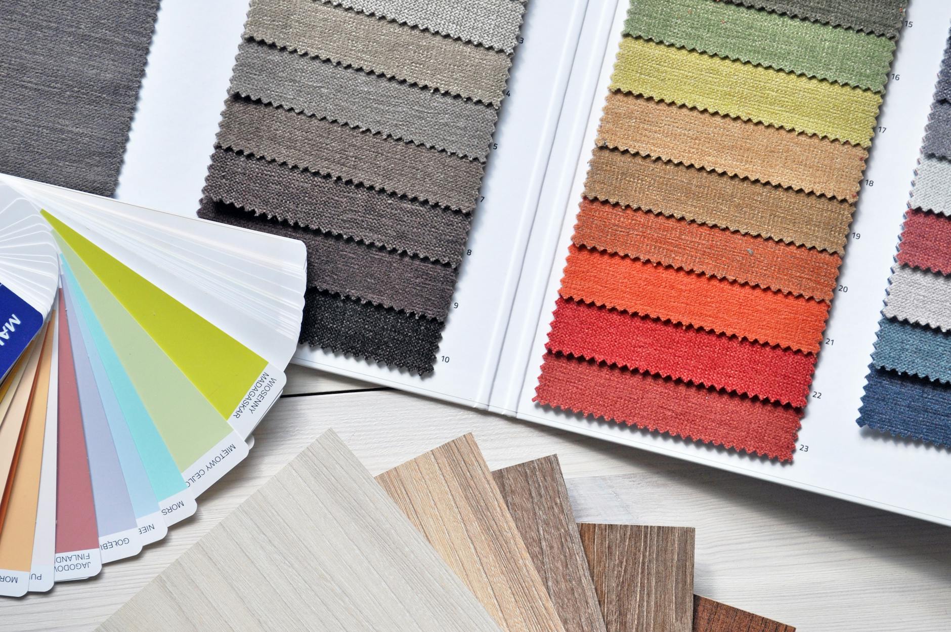
Start by working from a color wheel. You can find one of these online or at your local paint shop. Here you’ll find primary, secondary, and tertiary colors. This will help you focus on a color scheme down the line.
- Primary colors: your reds, blues, and yellows. These colors can’t be created.
- Secondary colors: you have oranges, greens, and purple. These are colors you can create when combining two primary colors.
- Tertiary colors: these are a mixture of secondary and primary colors to come up with unique hues. You use blacks and whites to play with different shades and tones.
2. Create Your Color Scheme
Now that you have your colors, it can be easy to create a color scheme that best fits your style and home decor. You can find four distinct color schemes to choose from:
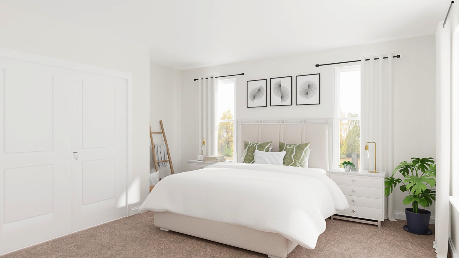
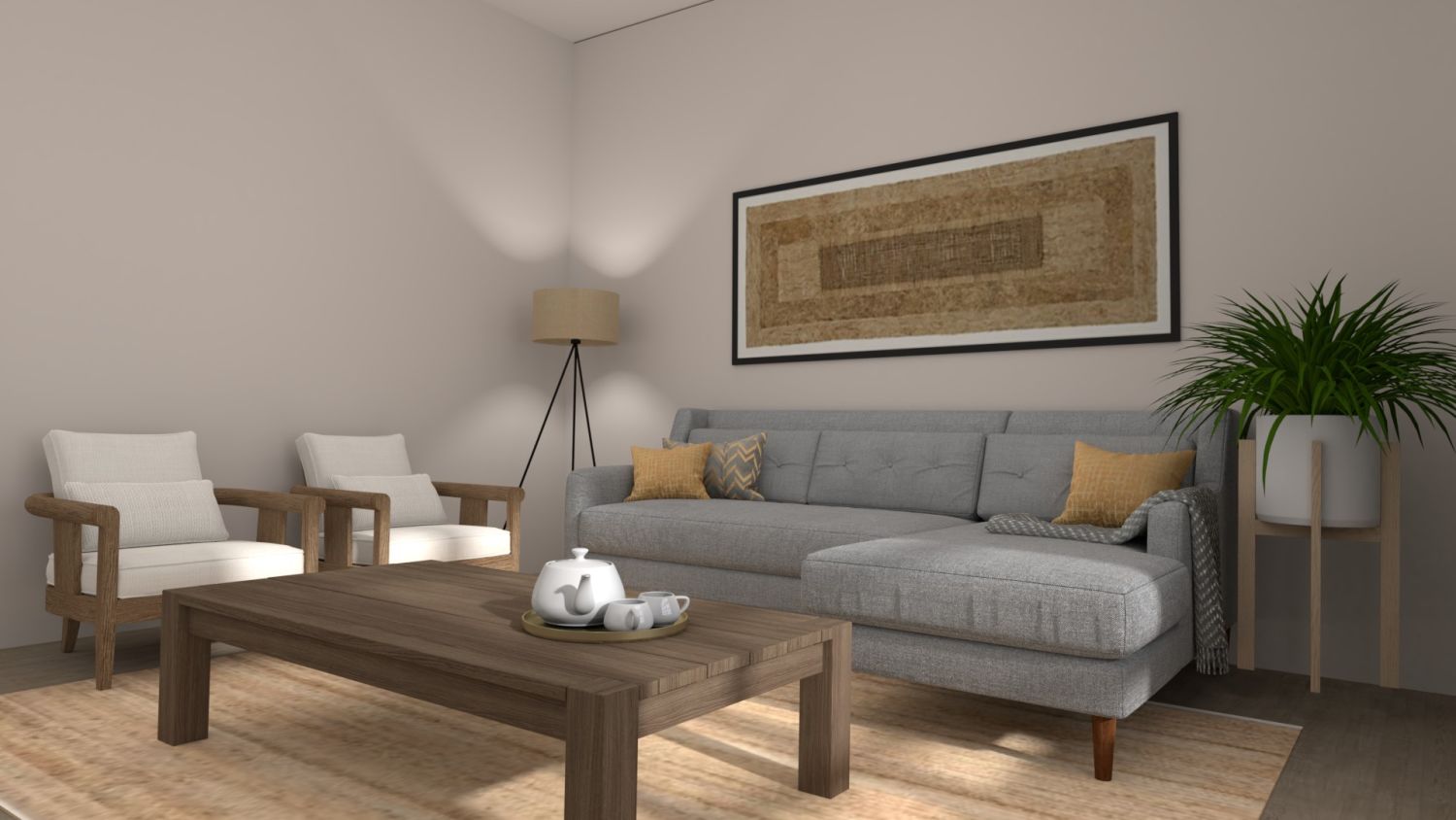
- Monochromatic: uses different tones of the same color across the room. You can have a dark blue wall, paired with soft blue sofas, and art in pale sky blue, for example.
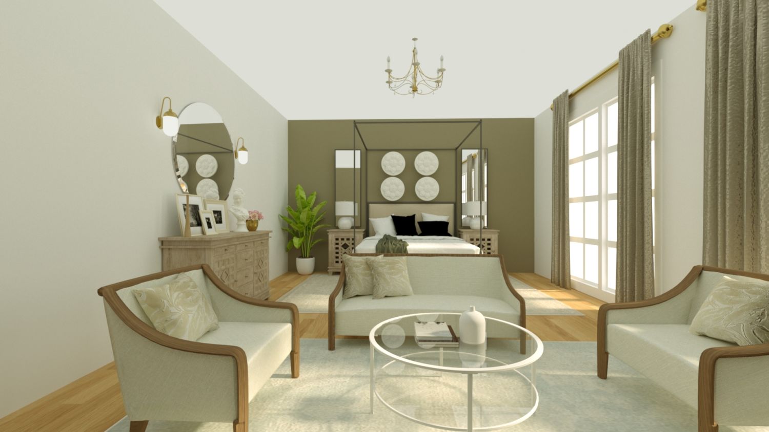
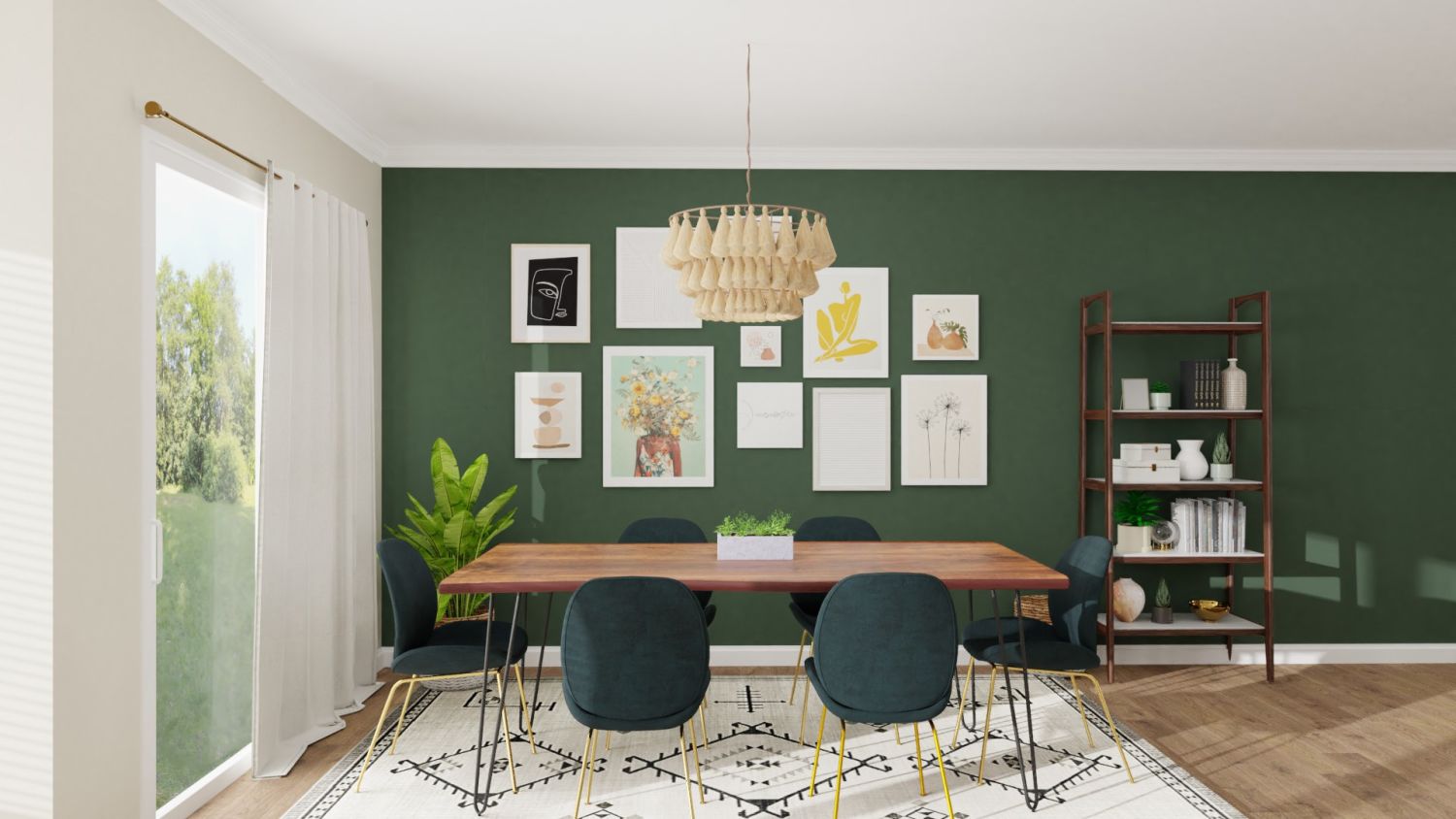
- Analogous: here, you use colors that appear next to each other on the color wheel. For example, yellows can be used with greens or orange to create a colorful and soothing color palette for your home.
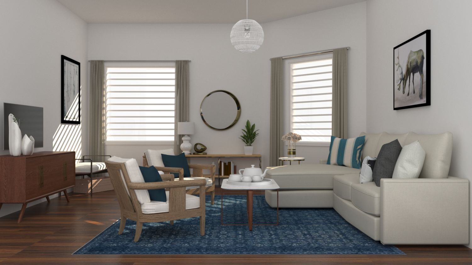
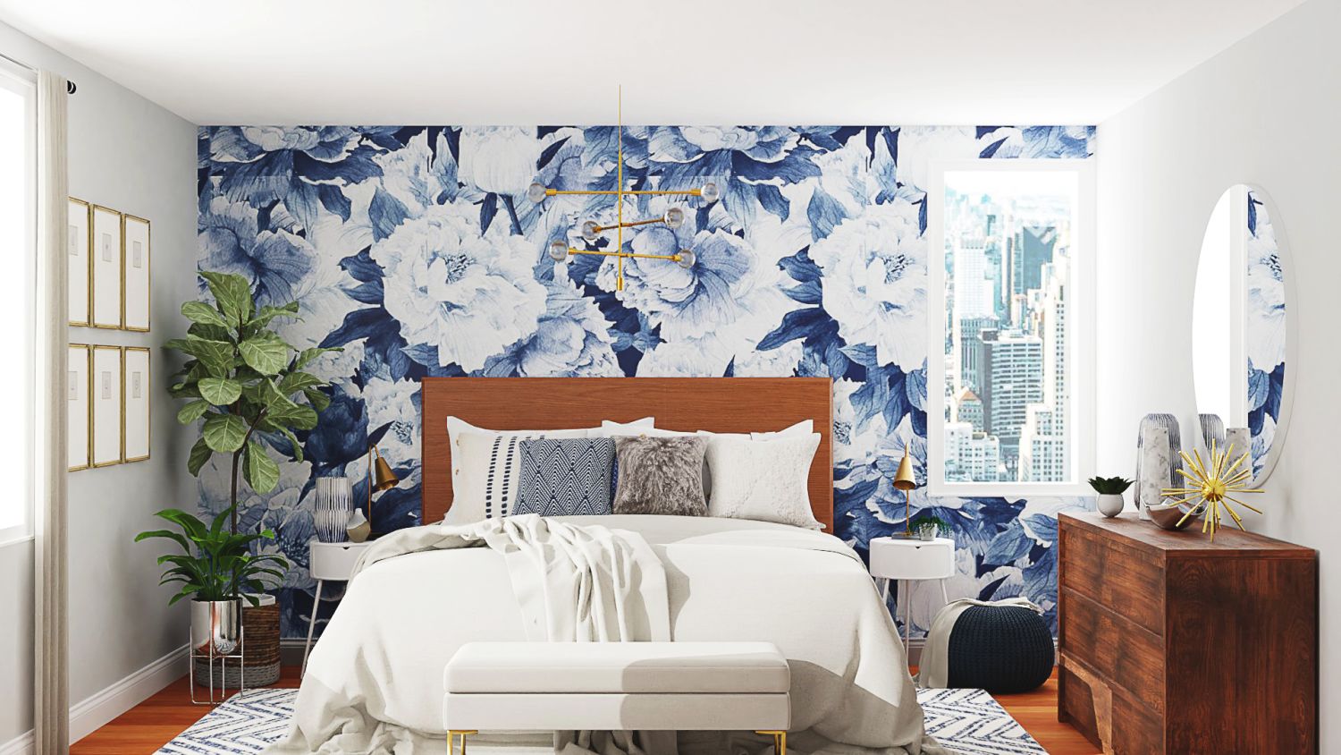
- Contrast: as you’d imagine, here, you use contrasting colors, usually opposite to one another on the color wheel—for example, greens with blues or reds with purples.
- Complementary: at last, you have colors that naturally complement each other. They can create a more dramatic look. For example, blue against orange is a popular complementary color.
When creating your color scheme, you want to start with the wall paint color. Then, move to pieces that are more challenging to find, such as furniture and rugs. Once you have the main pieces of your home decor, it can be easy to add accessories.
Tips for Mastering the Color Scheme
Now that you have the inspiration, it's time to create your color scheme. Take note of the main colors you noticed using the previous tips. If you need help finding the right colors, searching on any paint manufacturer’s website will give you an idea.
Then, choose between three to five colors that you repeatedly see in your decor right now. These are the core of your color scheme. When you're ready to incorporate them into your home's decor, there are a few things to keep in mind:
- Choose the lighter colors for painting most walls, approximately 60 percent of the room.
- Paint some accent walls in your living room and bedroom, around 30 percent in the mid-tone color.
- Finally, make a splash of color by the entryway or one wall in your dining room, only 10 percent in the brightest color.
When you follow these guidelines, your home will seamlessly incorporate your color palette to make your house look together.
It’s also important to play with warm and cool colors in your design. The more you understand how colors work in your home, the better. Here’s what to know about these distinctions:
- Warm colors: these are fun, energetic colors that can help rooms appear smaller than when not correctly used. You should use these colors to paint accent walls or create emphasis in a room.
- Cool colors: these are soothing and calming colors that give the feeling of more expanse, so rooms feel more spacious. You can paint an entire area with these colors.
3. Try Different Color Tones
When choosing the colors for large furniture pieces and decorative accessories, keeping your color scheme in mind is also helpful. In this case, you'll still work with your same three-to-five colors, but you'll expand your search into the different tones.
For example, if we think about the house with ocean views, using dark sandy tape for the furniture pieces will still be within the color scheme. The same applies to the other example; endless green tones complement the primary colors you previously chose. When you play with tones, remember:
- Pick mid-tones for rugs and large furniture pieces, even if they have a patterned design.
- Use the brightest tones for accessories like pillows and frames.
Other Things to Consider When Picking Your Color Palette
As you already know, the way paint looks on a swap is very different from how it looks on your walls and decor. When you’re choosing a color palette for home, things like lighting, your surroundings, and your decor will play a significant role. Here are some other things to keep in mind.
Remember Your Lighting Options
When choosing your color palette, remember that lighting will change the way specific colors look and feel. For example, if you prefer warm lighting, your wall paint color will likely look more yellow and mellow.
On the contrary, if you love bright, white lighting, your colors will stand out and shine more. When choosing your colors, try to place them by your current lighting to see how they react. Having a few paint and fabric swatches can be helpful.
Use Your Existing Decor as Inspiration
Your home already has a style. It can be more formal or casual, but you know it feels a certain way. If you look closely, you’ll notice that your furniture already has a theme.
Whether it's mid-century modern or farmhouse rustic, your style will be noticeable through your furniture pieces. Understanding your style and theme will help you get an overall idea of the colors you'll want to add to your decor.
Then, use your decor elements as a starting point. Most designers recommend picking one patterned fabric or wall art that has at least three or more colors. Use this focal element as your inspiration.
As you choose wall colors and other decorative elements, bring this main pattern with you and place it by the pillows, curtains, or sofa to see if the colors look harmonious. If they do, you've found the core of your color palette.
Incorporate the Outdoors
Another way to find a color palette is by letting your view inspire you. Look through your windows. What do you see? Greenery? Mirrored buildings? Delicate cherry blossoms? Concrete? The beach?
Think of your window's view as a piece of wall art that decorates your space because, indeed, it does.
As you look through your window, take note of the most prominent colors. If you enjoy a beautiful ocean view, your colors will be sea blue, whites, and sandy taupe. If your window leads to a park or a lake, you'll see greens, browns, and dark blues.
Bringing these colors indoors will make your home feel surrounded by nature.
Color Palette Ideas Trending in 2021
If you still feel at a loss trying to find the best color palette for your home, then take inspiration from the trendiest colors of the year.
Warm & Welcoming

For anyone looking to create a warm and welcoming home experience, this color palette is inspired by rustic tones that bring nature inside. This color scheme includes Rumba Orange (M230-7), Charismatic (PPU6-14), Bubble Shell (S160-3), Cider Spice (S210-5), and Red Pepper (PPU2-02).
Natural & Exciting

If you want a natural and calming mix, then the blues and greens blend from this collection will help you create a soothing sanctuary. This color palette includes Secret Meadow (S360-6), Back To Nature (S340-4), Light Drizzle (N480-1), Bluebird (PPU15-12), and Dragonfly (PPU12-03).
Modern & Traditional

Finally, if you're looking for a modern and traditional color palette that blends pastes with neutrals, here's a collection to help you. Perfect for a multi-family home that wants to be dynamic yet warm and lovely. This color scheme includes Dusty Lilac (N110-1), Creamy Mushroom (PPU5-13), Painter's White (PPU18-08), Battleship Gray (N360-4), and Graphic Charcoal (N500-6).
Incorporating Your New Color Palette into Your Home's Design
After choosing your home's new color palette, it's time to spread it throughout your design. Start a project today, and connect with one of our interior designers to help you start.
Beyond walls paint colors, we'll evaluate the best tones and colors to choose your furniture, rugs, curtains, and even accent pillows.
If you want your house to look like everything fits into place, working with an interior designer will help you make it happen. Let go of the nervousness and start designing your dream home today.
Get this room designed for you
- A real designer, 1:1
- Scaled to your space
- Shop the look in one place
Design Journeys
Real stories from real customers


More to Explore
Check out other exciting designs


Editors Pick
Top designs worth exploring


